Mortgage calculator on the listing page
Product Designer · Domclick · Jun – Sep 2022
Buyers chose a property first, then had to leave the listing to calculate a mortgage, two steps that belonged together. I brought the calculator right into the listing card, on a page owned by another team.
Problem
Mortgage volumes dropped in 2022, and the calculator lived apart from listings
My role
✦ Embedded a calculator into another team's listing page✦ 5 in-depth interviews✦ 3 iterations
Impact
✦ Mortgage applications +3%✦ No harm to the partner team's metrics
Timeline
Jun – Sep 2022
Skills
✦ Product thinking✦ User research✦ Design
Team
✦ Product Owner✦ CJE✦ Product Designer✦ 3D Illustrator✦ Developer
Product & Problem
Context
Users picked a property first, then had to leave the listing to find a mortgage calculator or open one in a second tab and re-enter the property details by hand. The two steps lived apart, even though they belonged together.
Business goal
Increase the number of mortgage applications.
Problem
In 2022 mortgage volumes dropped, this is the core business problem. The question for my team: how do we grow mortgages while staying genuinely useful to users?
Challenge
The listing page belongs to another team, where every block is carefully tuned. I had to fit the calculator so it stayed compact, didn’t break the existing flow and didn’t harm the other team’s metrics.
Key Design Decisions
Rethinking the client path
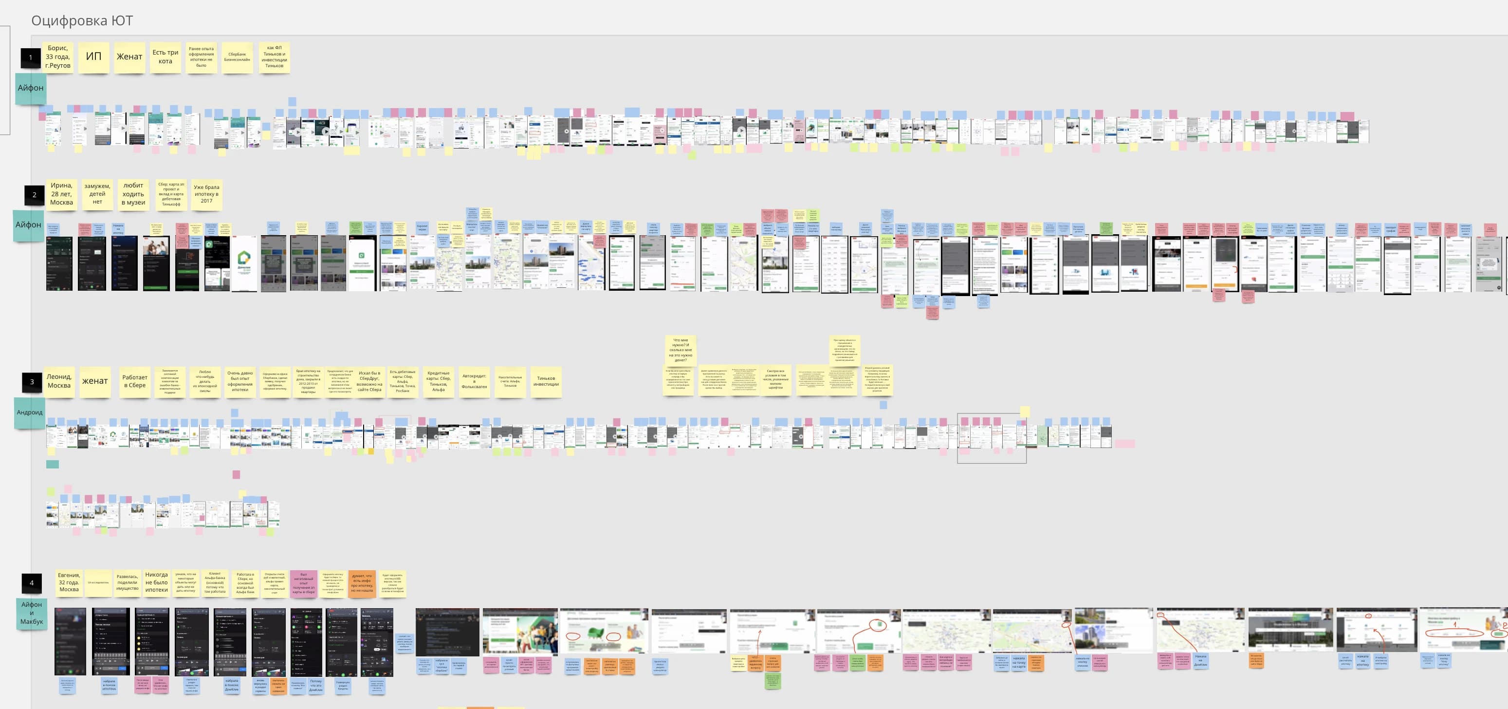
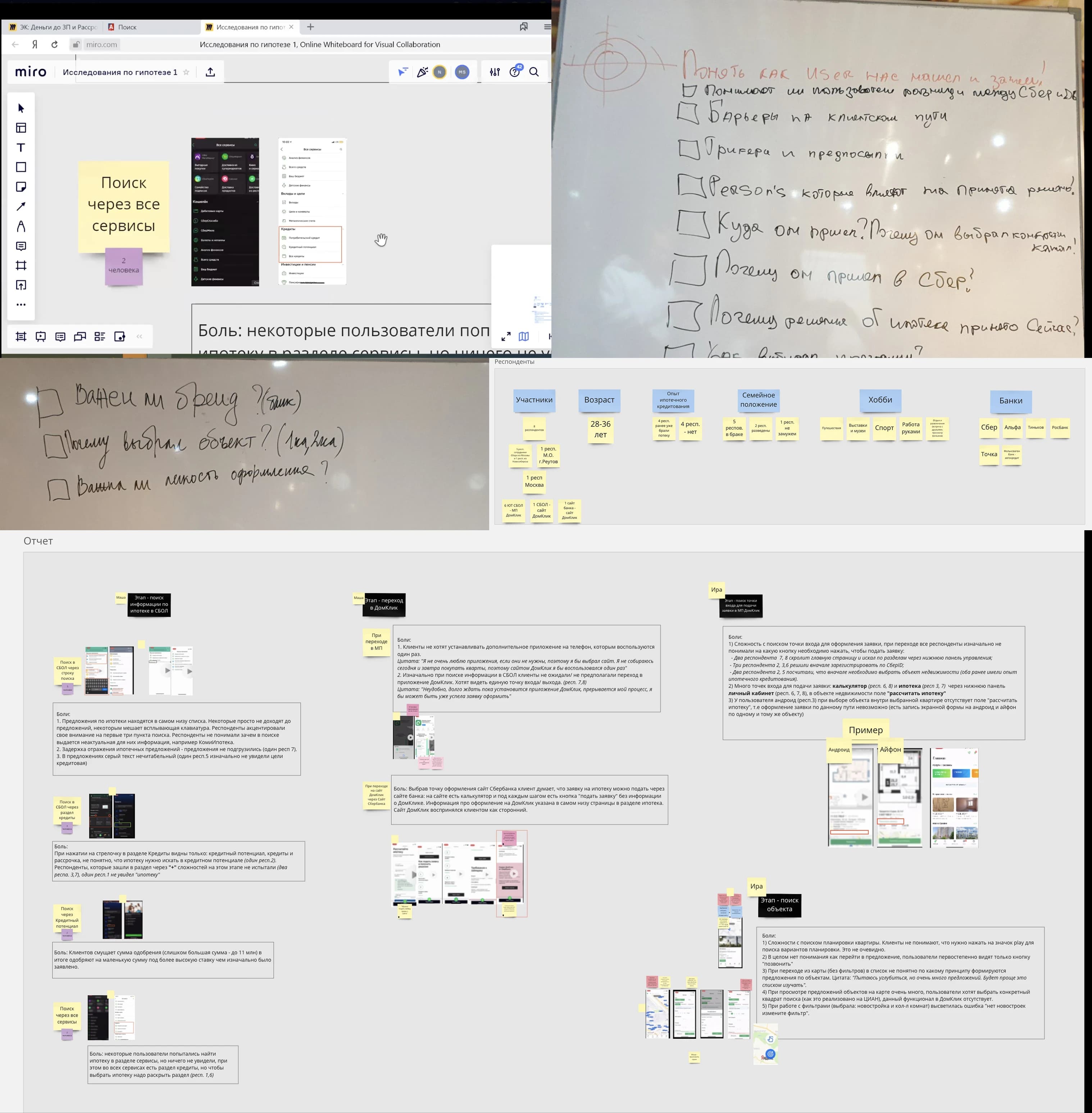
Research pointed to one clear behaviour: people choose the property first, then look for a mortgage. That was the opportunity: put a calculator entry point on every listing page. Our researchers ran 5 in-depth interviews to pin the real pain.
The hypothesis
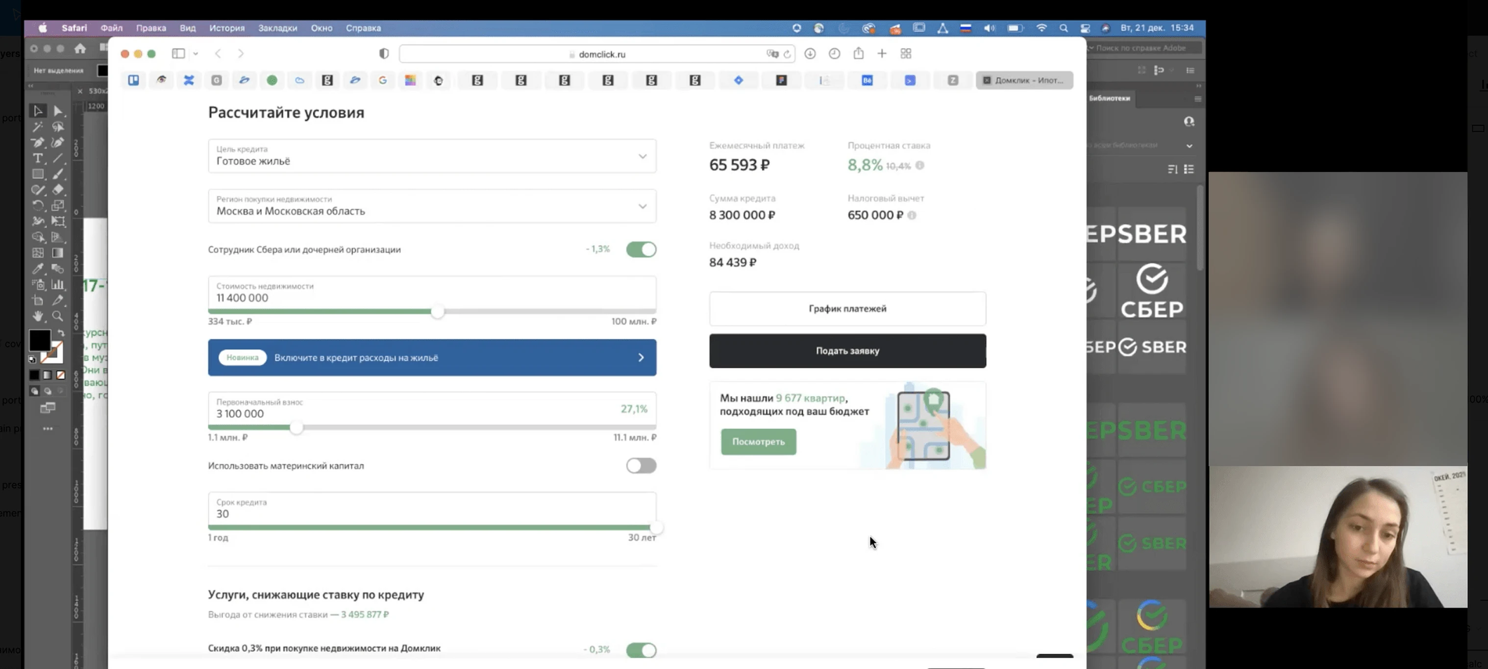
With the PO and CJE I shaped it: a calculator showing all available mortgage programs directly in the offer card would make buying-with-a-mortgage easier.
Explorations and concept validation
Before testing, we set a clear success path from the interviews: the user understands several programs are available → scrolls to the widget → reads it correctly. I ran three iterations, testing each version against that path.
1st iteration
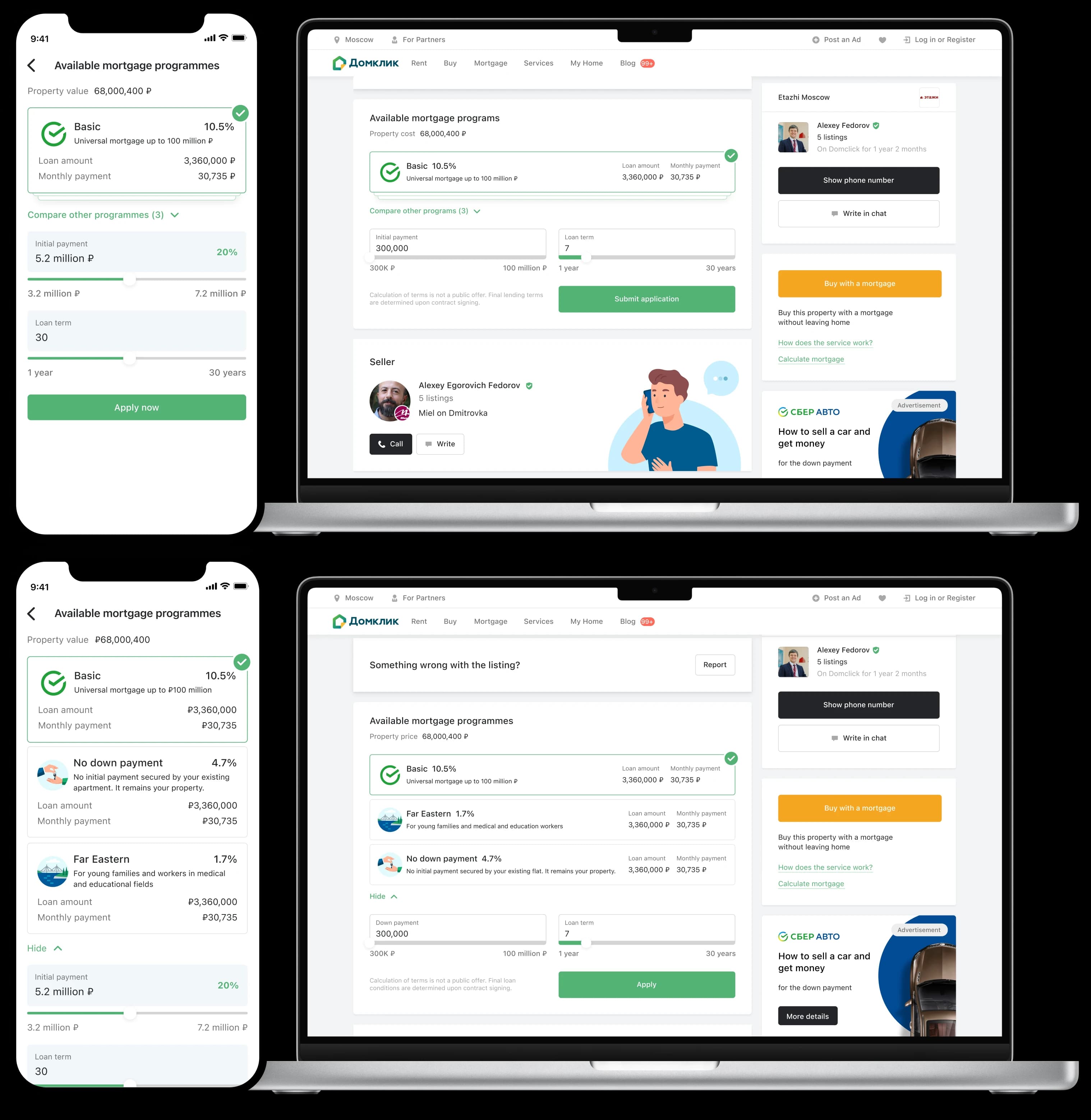
The first version surfaced every program with its monthly payment directly in the card. What testing showed: it takes too much space and “Offer card” team (page hosts) said it must be smaller, users won’t scroll.
2nd iteration
I reduced the height of our widget and also restructured it around comparing programs: rate, loan amount and payment side by side. What testing showed: not enough choice (users want several programs at once) and some elements were invisible (some users missed the spoiler under the programs).
Final solution
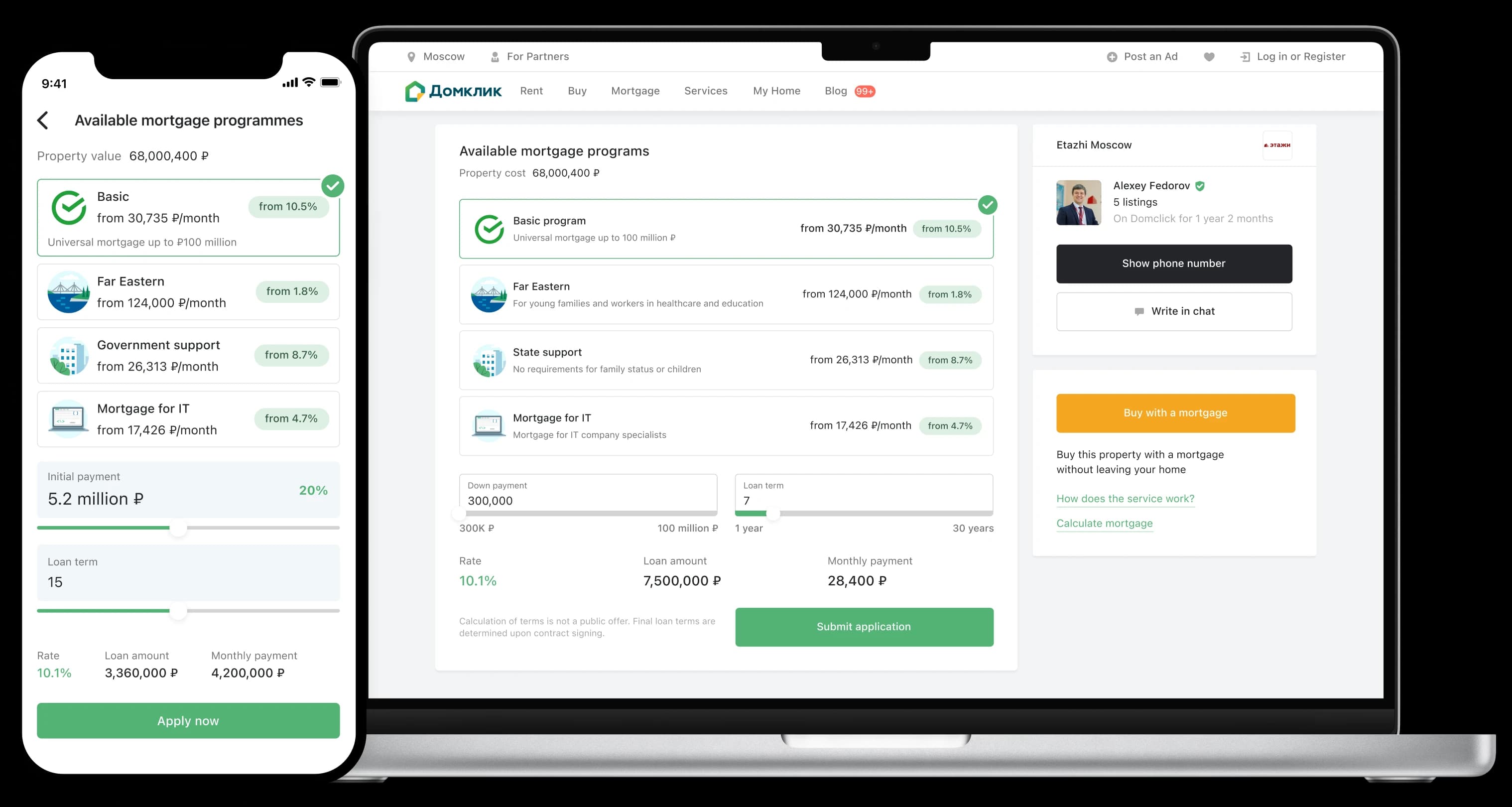
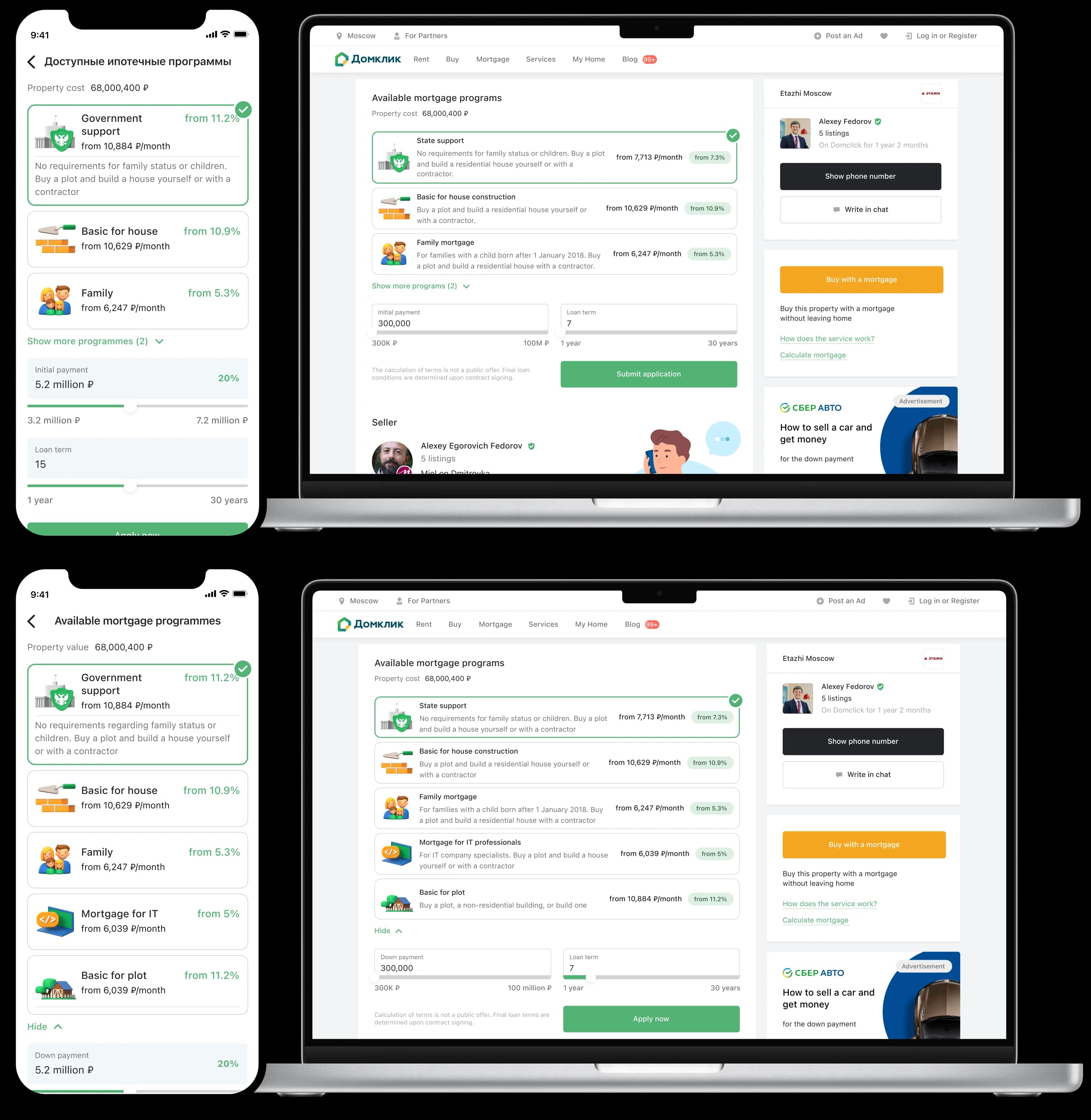
I made it simpler by showing the first 3 available programs with an expanded section. We also made our widget more compact and easier to scan, so it fits nicely on someone else’s tightly packed page. This way, users can see their options clearly and take action without leaving the listing.
Outcome
Result
Mortgage applications:
Reflection
Reflection
Working on another team’s platform turned this into as much a teamwork challenge as a design one: you have to sync up early, keep both teams’ goals in mind and always hunt for a middle ground, there’s usually a way to make it work.
If I did it again, I’d set shared success goals with the other team from the start and track how the widget impacts their funnel right away, so “don’t mess up their numbers” is a solid promise, not just a talking point.