Improving the Google Ad card
Product Designer · Halalbooking · 2026
Problem
A redesign hid the sign-up for member prices and Google traffic dipped
My role
Impact
Timeline
2026 · 30-day performance read
Skills
Team
Product & Problem
Context
Business goal
What changed
Problem
Challenge
My Role & Contribution
- Diagnosed the conversion drop and framed it as a UX visibility issue affecting registration (the core business goal)
- Partnered with stakeholders (incl. GHA) to confirm constraints affecting performance and visibility
- Designed and shipped a focused, low-risk change across a multi-language interface
- Ran a 30-day performance read to avoid false wins from short baselines and communicated the nuanced outcome
Key Design Decisions & Process
Exploring the direction
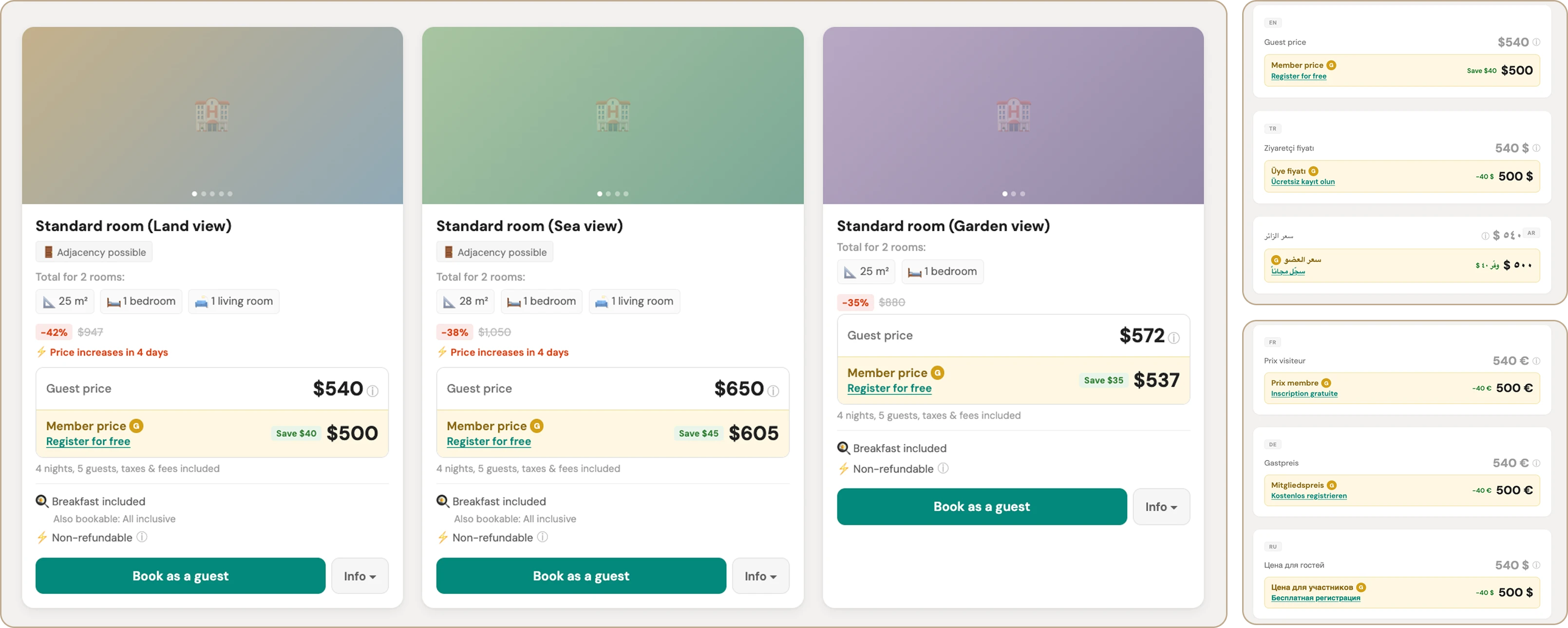
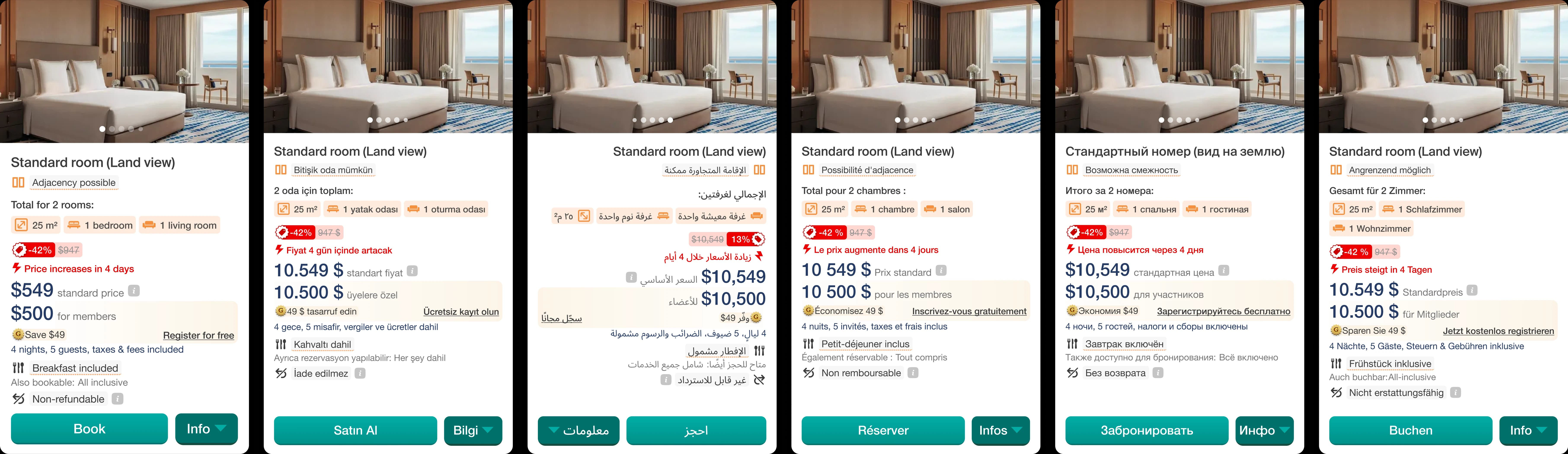
Localization-first layout
Principle: the layout has to hold up in every language, not just look right in English.
Explorations: I tried layouts with tighter, more compact arrangements of the price and cue. They looked cleaner in English but broke once long translations wrapped onto multiple lines. And fixed component widths couldn't absorb the variation between locales.
Final solution: a layout that doesn't depend on short copy or fixed widths: it stays clear and consistent across long translations and different locales.
Designed for multi-currency and density
Principle: stay readable with the longest possible prices and across a page that can hold many cards.
Explorations: I tested more prominent, heavier treatments of the price. They worked on a single card in EUR/GBP, but longer numbers in other currencies pushed key actions around, and the heavy treatment became overwhelming when repeated across 20–30 cards on one page.
Final solution: a layout that remains stable even with the longest prices and stays consistent when repeated, reliable rather than fancy elements that only work for one currency on one card.
Working within technical constraints
Principle: communicate the member value without depending on things the system can't do.
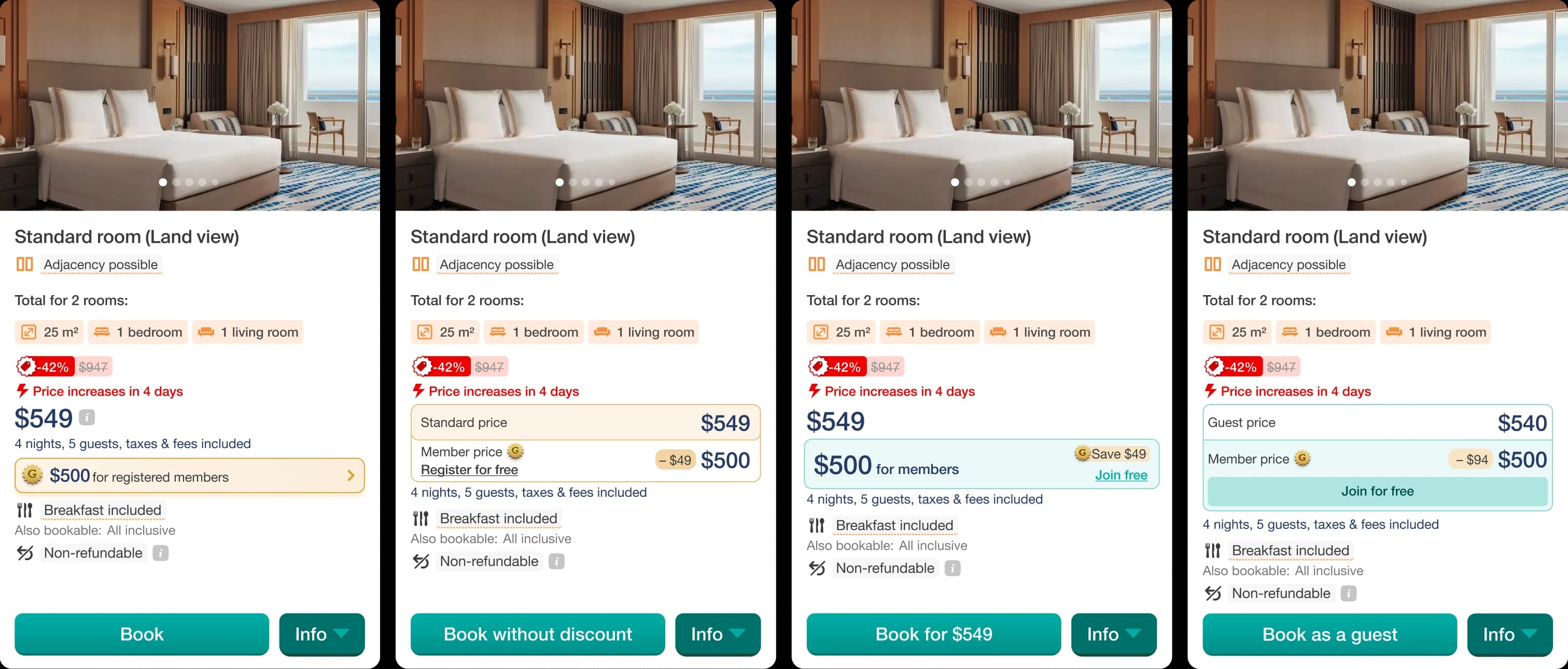
Explorations: the strongest concept put a dynamic, per-room price directly on the CTA button. But we couldn't render a dynamic per-room price inside the button, so this wasn't buildable.
Final solution: the card itself carries the member-value cue, so the message doesn't rely on button content, working with the technical limit rather than fighting it.
Clarity without fake preselection
Principle: the member price should be obvious, but never feel like a trick.
Explorations: I landed on a few strong candidates and showed them to several people in a quick hallway test. The most prominent version made the member price stand out so much that people read it as already selected, a kind of fake preselection. That wasn't honest.
Final solution: I reworked the UI so the member value reads clearly without pretending it was a choice the user had already made.
Final solution
Outcome
Result
Booking start rate:
Membership created:
Booking committed rate: