Viktoriia Ionova
← All projects
🖼
Mortgage matrix — main flow (hero)

Role

Product Designer

Timeline

March 2022 — January 2023

Skills

Product thinkingUser researchDesign

Participants

Product OwnerProduct Designers (x3)3D IllustratorDesign LeadDevelopers (x5)

Product & Problem

Context

Choosing a mortgage is overwhelming: too many programs, legal jargon, hidden conditions.

Business goal

Fewer wrong applications → fewer refusals.

Problem

Users can't tell which program fits them and suspect the bank is hiding the real terms.

Challenge

To fix it, the bank has to take on the risk of choosing terms for the user.
4th quarter of 202031.5%
4th quarter of 202136.6%
4th quarter of 202246.2%

Mortgage refusals hit a historic high: half from wrong-program applications. Source

My Role & Contribution

As the designer on the mortgage-calculator team — the first step in the approval flow — I coordinated designers across the other teams to keep our decisions aligned. I also took on the user research myself, because I wanted to understand our users first-hand.

Key Design Decisions

  • Clear next step
  • Visible maximum amount
  • Convenient conditions
  • No hidden terms, trust

Explorations

  • 3 iterations
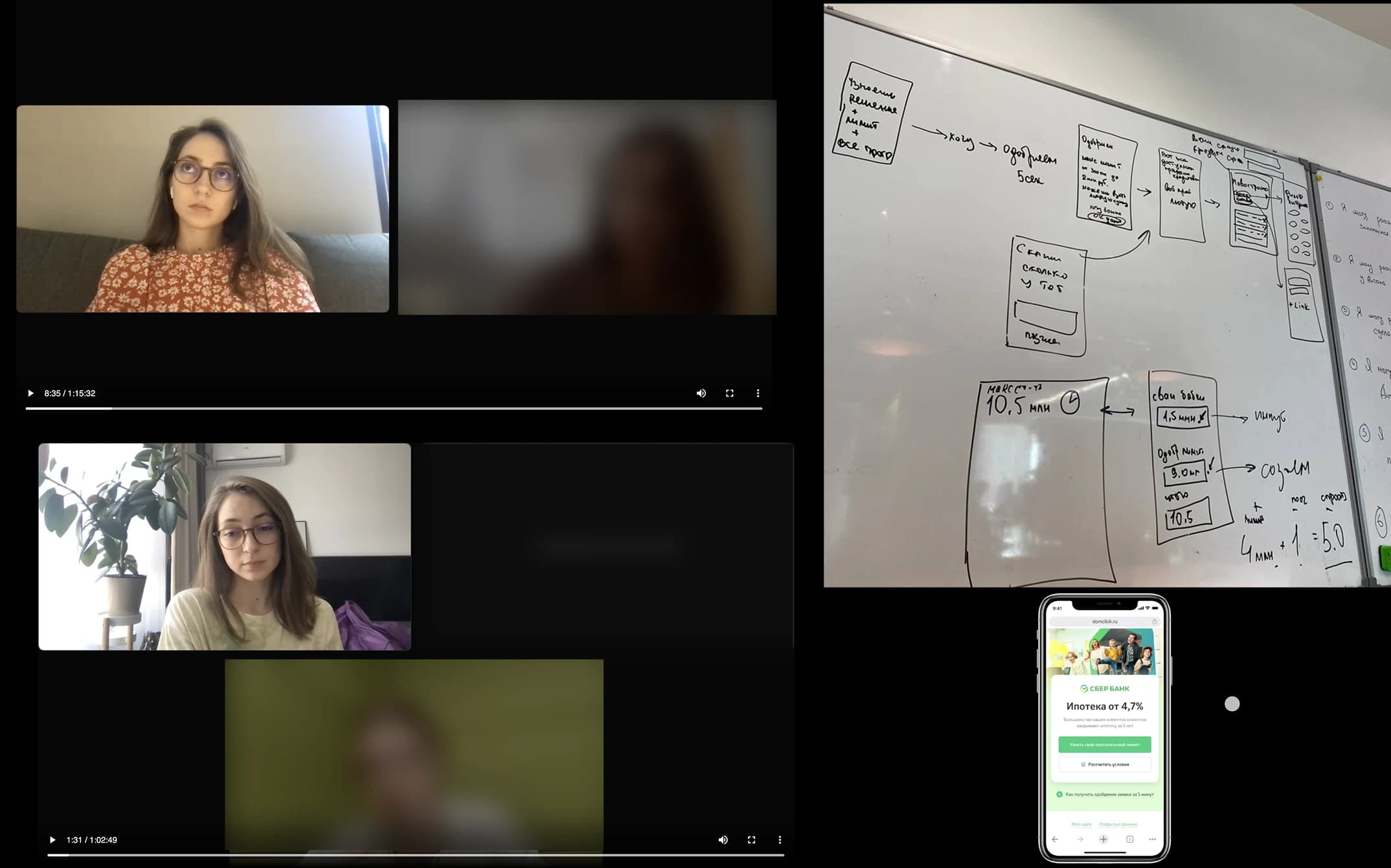
  • 15 usability tests
  • Prototyped and tested across sprints — each round narrowed what worked
🖼
Exploration flow — process overview

1st iteration

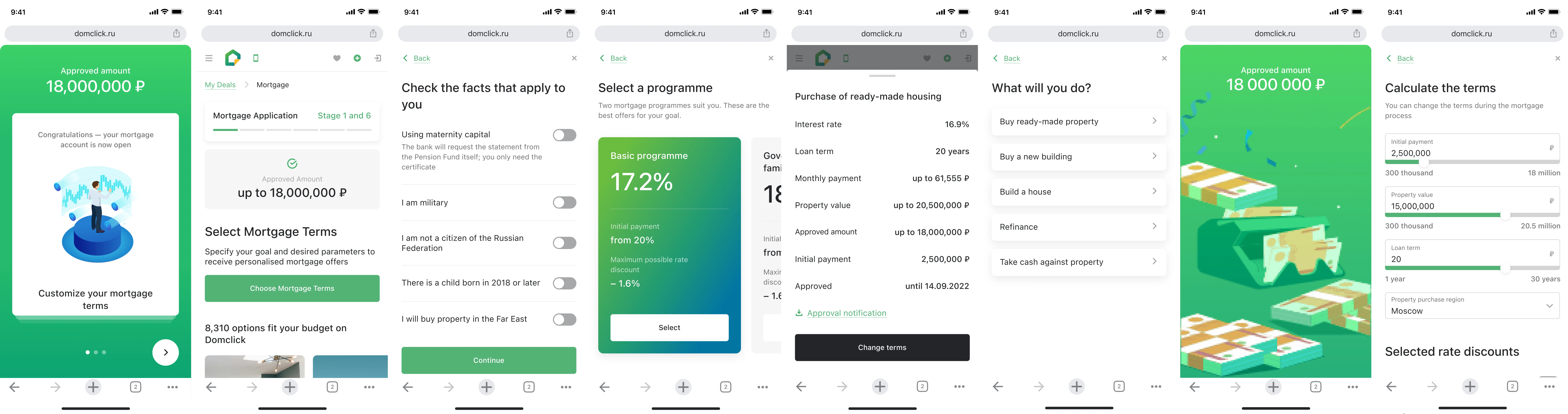
🖼
1st iteration — mockups

+ Maximum amount: it's clear what the maximum amount available to them is

+ Onboarding: clear explanation of further actions in onboarding

+ Conditions: convenient conditions for the mortgage program

- Difficulties with the selection: they still struggle to choose a program and aren't sure it suits them, so they wouldn't send an application

- Unclear what to do: users don't understand where they've landed and what to do on the very first screen

2nd iteration

Based on that, the second iteration focused on making programme selection clearer and reducing the number of choices upfront.
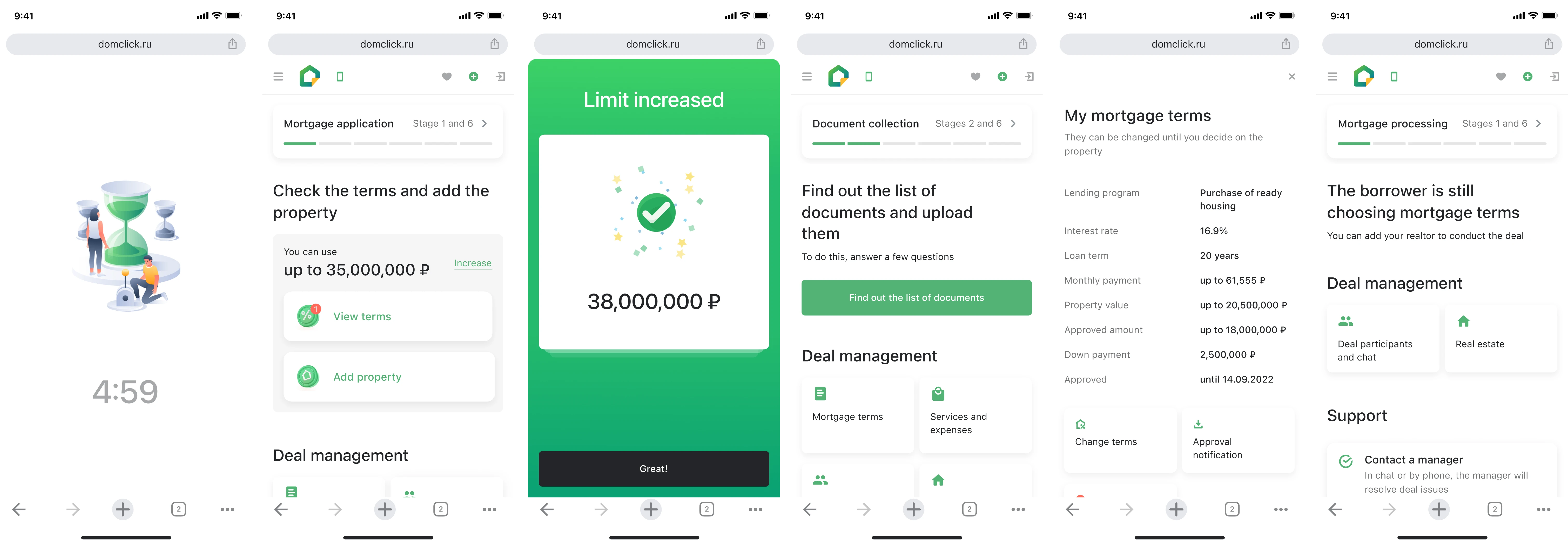
🖼
2nd iteration — mockups

- Unclear what to do: it's hard to understand what to do after onboarding — too many buttons

- Comparing programs is unclear: the compare functionality isn't obvious

- The limit FROM and TO: users don't understand the FROM–TO limit the bank approved for them

- Difficulties with the selection: there's too little information to choose a program

But despite the complex functionality, users liked the idea that they get approved for the maximum conditions and can do anything within it — so we moved on to the third iteration.

Final solution

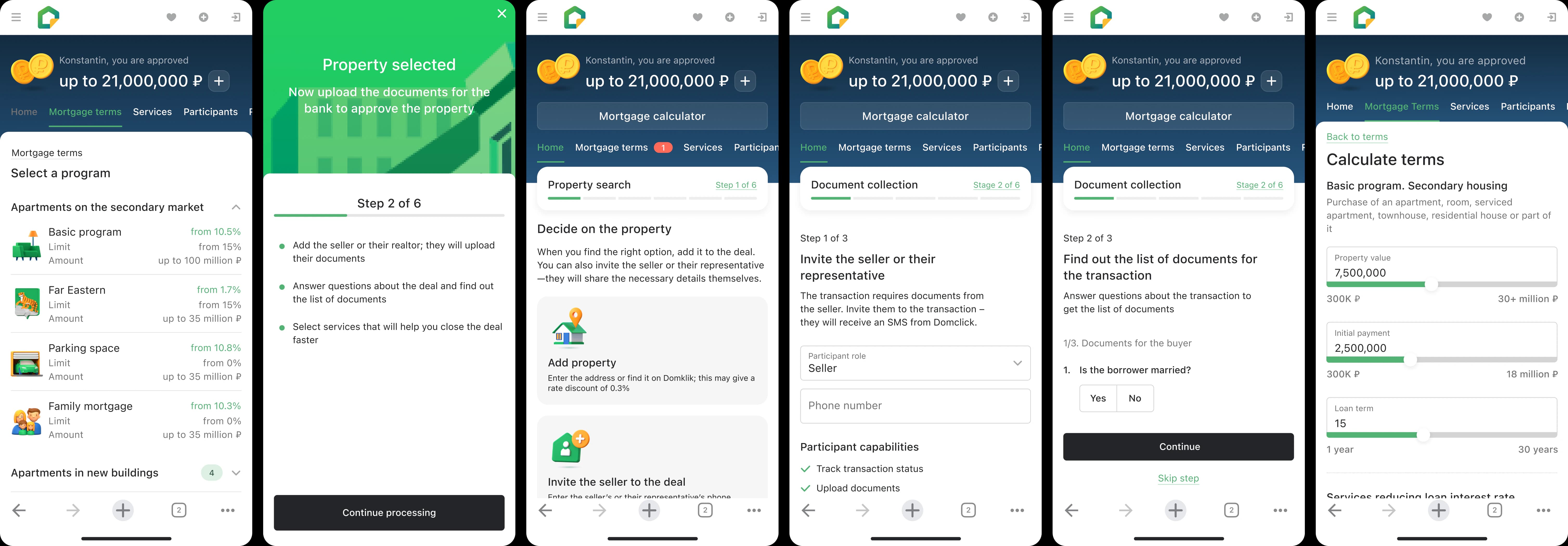
🖼
Final solution — mockups

+ Clear what to do: the process is built sequentially and users understand what awaits them at the next step

+ Conditions: convenient conditions for the mortgage program

+ Maximum amount: it's clear what the maximum amount available to them is

+ Onboarding: clear explanation of further actions in onboarding

🖼
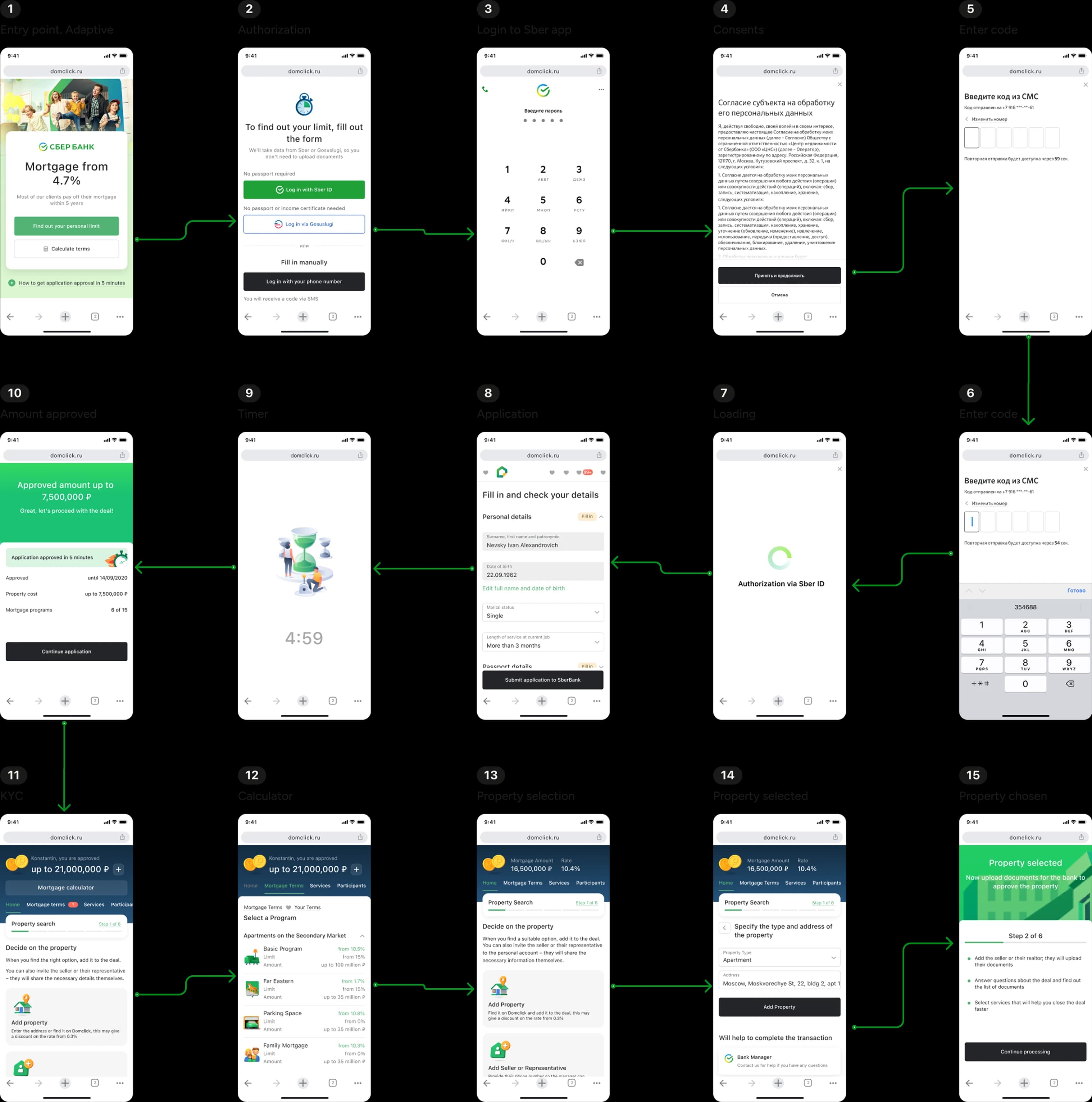
Main user path
🖼
Desktop mockups
We wanted to give the official legal terms of mortgage programs some kind of identity, so we ordered a set of icons from a 3D illustrator.
🖼
3D program icons (16)

Outcome

Result

First pre-approved mortgage limits on the Russian market — we were the first to show users what mortgage they could get before choosing a property.

MAU: 10x

Conversion to an actual deal: held steady

Removing the barrier brought in many more people who were just curious or exploring — not ready to buy right away. Usually, when your audience gets that much bigger and more casual, fewer of them convert into real deals. But our conversion rate didn't drop: the design still worked well for the smaller serious group, even with 10x more casual traffic mixed in.

Conclusion / Reflection

Communication is the key to success

This was a pivotal experience in understanding what it takes to succeed as part of a team. I learned how important it is to communicate with the team clearly and precisely, and to share work early and often.

Quality, not quantity

It's very important to carefully work out all client paths at the development stage, so that later you don't have to make a lot of prototypes and validate them with users.